Michigan Benefits
A ten minute application for Michigan’s two largest public benefits programs.
I designed a mobile-friendly combined SNAP & Medicaid application for a pilot program in Michigan. The state already had an online application, but it was difficult to use and took 45 minutes to complete a joint application. Over the course of 10 months, I collaborated with a product manager and a team of engineers.
My contributions included interaction design, copywriting, prototyping, and research. The team’s previous designer had created two separate Medicaid and SNAP flows. This, in addition to our partner Civilla’s paper form redesigns formed the invaluable basis for my work.
USER NEED
Access and usability
“It’s hard with two kids – getting on the bus and bringing them to the office. A lot of times they will interrupt. I need to be able to do this at home whenever my kids are sleeping.”
Many clients rely on their phones for internet access, and may have limited data. The inability to submit documents on mobile is especially limiting.
The existing online application was confusing, long, and hard to use. Clients have limited time, and many are dealing with disabilities, caregiving, and multiple jobs.
USER NEED
Figuring out families
“If someone is missing from the case, everything changes. Residents may be getting more or less than they are entitled to.”
Household composition is the foundation of means-tested benefits. To determine eligibility, the right people must be on the application
The rules for who is part of a household can be complicated. This is compounded in a combined application, where different programs define households in different ways.
Further, eligibility criteria is based on assumptions about traditional household makeup and stability that doesn’t match clients’ actual lives.
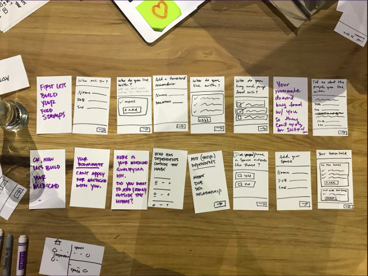
I started with the core of the application, the household builder. This was a period of intense iteration. I started on paper, with an index card for each question I thought might be in the application.
Collaborating with a product manager, I ordered and reordered them until we had a flow that I thought might work.
I followed this with a series of clickable prototypes. I went out into the real world to test these, intercepting participants in benefits office lobbies.
Our research partners in Detroit conducted additional testing.
The final product is accurate, easy to use, and supports diverse family types. It strikes a balance between support and flexibility, guiding users through the process.
The application has many additional questions about income, expenses, and assets.
I ran a card sort exercise where I asked benefits recipients to categorize and order these questions. I used the results to redesign the flow, and group them into sections that better matched users’ mental models.
Skip logic means users only see the information that’s relevant to their situation.
There are many required questions, so I was careful to minimize the number of interactions necessary to complete the application. Tapping is favored over typing.
Although the app supported mobile document upload, we heard feedback that users weren’t using this feature. I added an illustration to encourage users to take pictures of their documents with their phone.
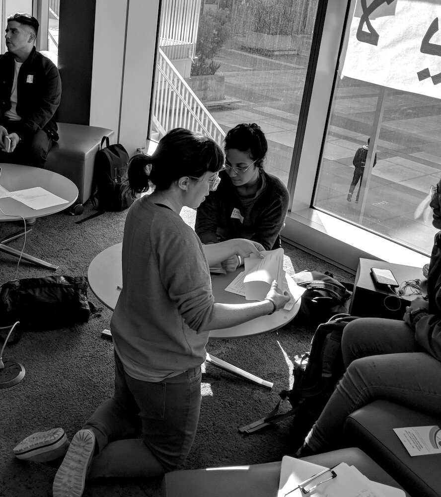
Testing paper prototypes.
Impact
2 days: Reduction in days to determination
10 minutes: Time to apply, down from 45 minutes
18%: Increase in approval rates